They represent the progress that you’ve made as a trainer. And here are also some seriously cool looking gym badges too. I’m a sucker for silly little collectibles, to the point where I own several real gym badges myself. To celebrate what I consider one of the small joys of Pokémon, I’m going to be ranking what I think are the best badge designs from every generation. Oh, and spoiler alert: There are no Gen VIII badges on this list because they suck.
20. Rainbow Badge
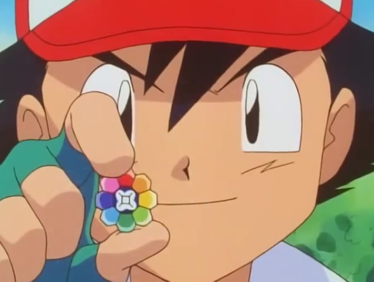
Erika is one of my overall favorite gym leaders for reasons that I won’t disclose here. Her badge happens to also be one of the best looking, but it only gets bottom of the list for one specific reason: It’s not relevant. As a grass type gym leader, you would expect the badge to be centered around that theme. And indeed it is for most grass gyms in the future. However, Erika’s rainbow badge looks like something that a typeless gym leader should have. That being said, it’s still great looking. I’d say it looks like it’s made up of a variety of precious stones, and is honestly just really pretty. It’s just a shame that the colors don’t represent the different Pokémon types. Although, a 15 stone badge would probably cost the league a fortune…
19. Feather Badge
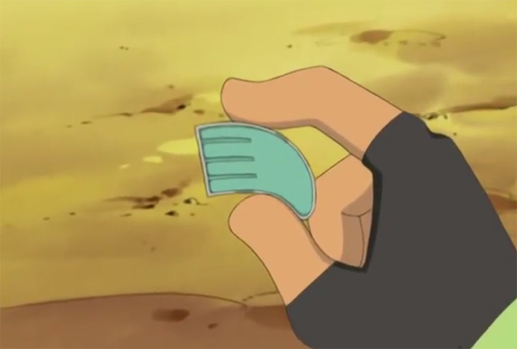
On the other side of the spectrum, we have a badge that does actually bear some relevance to the type of gym it comes from. There are actually a few different feather badges on this list; this just so happens to be the worst of the best-looking of the bunch. That’s because while it looks like a feather, it’s the type of feather that an eight-year-old would draw for a school art project. It almost looks like it could come from a steel type gym. But that’s not an inherently bad thing, because the badge does look great.
18. Volcano Badge
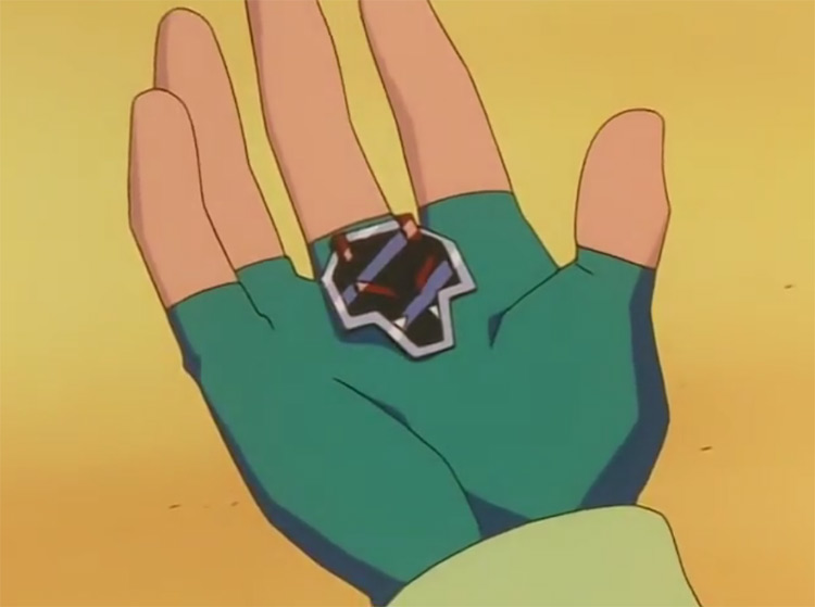
The volcano badge is one of the OG eight. It’s Blaine’s badge from Cinnabar Island. Now it doesn’t look like an actual volcano, which is a shame, but it clearly looks like some weird Picasso-esque drawing. Very obviously fire-related, though. And fierier looking than the feather badge is feathery looking, so kudos.
17. Fog Badge
Why this badge is called the fog badge, I don’t really know. It’s not like Morty’s gym has any overarching fog teams related to it. Fog is just spooky, I guess. That doesn’t take away from the fact that this is the best looking ghost type badge that has ever appeared in the series. Which isn’t saying much because there aren’t that many of them, but still. It looks like a very simplified and rudimentary ghost. It’s just cool and silly looking to get a chuckle out of me.
16. Glacier Badge
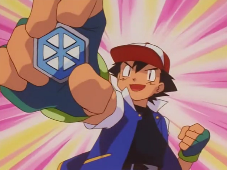
Here’s another Johto League badge for you. But this one’s substantially more relevant than even the fog badge. Why? Well, there’s clear room for interpretation with the fog badge. But the glacier badge is very clearly meant to be a snowflake. There are other better-looking ice type badges that actually resemble icicles, and one that really should be called the glacier badge… but in the spirit of Christmas, I’m giving the glacier badge a spot on my list.
15. Coal Badge
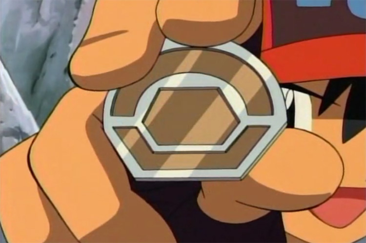
Sinnoh and Unova had the best badges out of any game. And it’s not even close. You only really appreciate these designs when you look at the state of the Galar badges. They’re so bad that none of them appear on this list. Now the coal badge is the first one you get in Sinnoh from everyone’s favorite miner, Roark (take that Clay!) Does it resemble a piece of coal? Sort of, but that’s okay with me. The first gym badge you get should always be sleek and simple, and the coal badge is the perfect example of that.
14. Icicle Badge
The icicle badge should be the glacier badge. It’s not an icicle. It looks like the damn thing that took down the Titanic (or the S.S. Ann if we want to stay in theme). That being said, it obviously looks like ice, just a large piece of it. The fact that I can look at it and tell that it came from an ice gym is more than I can say for most league badges, including one or two on this list.
13. Jet Badge
Skyla’s gym is my favorite that has ever appeared in any game. Who doesn’t fantasize about shooting annoying little children out of cannons? The badge clearly resembles a feather, but I think the Feather Badge would work better here. That one looked like a steel type feather, and what are jets if not big steel birds? Even still, this Unova badge is sleek, clean, and looks like it’s made from some sort of resin of precious stone. Skyla also went through the trouble of coordinating the badge with her outfit. Which is the kind of effort that I can get behind.
12. Bolt Badge
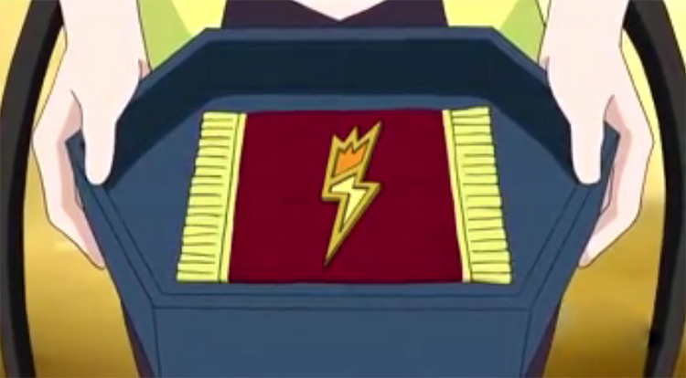
Now here we go. This is a damn gym badge. The bolt badge looks like, guess what? A lightning bolt. It’s spikey, explosive, yellow, and has that infamous zig-zag pattern that I still use when drawing lightning even though I’m 21. There’s no beating around the bush here. It’s just the perfect example of a name and design correlation.
11. Fairy Badge
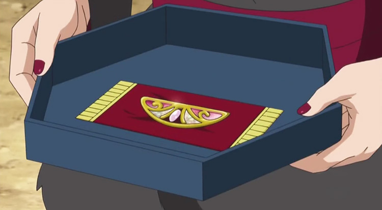
The fairy badge should have come from the first generation that fairy types never existed in, and confirmed my suspicions of Valerie being a total narcissist. Skyla may have color-coordinated, but Valerie has designed her entire outfit and personality around this notion of a butterfly. On the topic of butterflies, that’s what the fairy badge is. Butterflies aren’t fairies, I’ll give you that, but they’re close enough. This is easily the prettiest gym badge of the bunch. It’s made from gold and what looks like transparent opals. And there’s something about that pink and gold combination that’s just pretty; there are no other adjectives I have for it.
10. Rumble Badge
The rumble badge looks really weird. But not in an overtly weird way. Ironically, it’s this weirdness that factors so heavily into why I’ve put it right in the middle. It’s clearly meant to resemble two boxing gloves hitting one another, which ticks the rumble box rather cleverly. However, while one glove is perfectly detailed, the other is smaller and is just a grey box. It almost looks like the game couldn’t load the textures. Despite that, the fact they named a badge the “rumble badge” and actually made the design resemble a fight is a small stroke of genius, so I’m willing to overlook its downsides.
9. Plant Badge
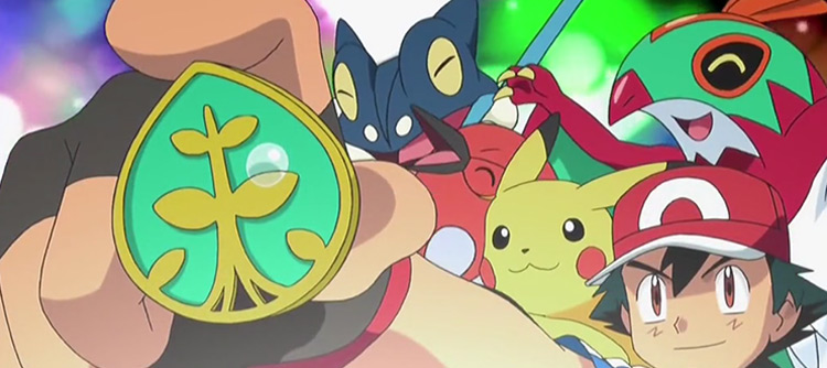
This is what Erika’s badge should have looked like. It’s a leaf, plain and simple. Although I’m not sure why it isn’t called the leaf badge… It’s not just shaped like a leaf. It’s a goddamn expensive-looking leaf. And it’s decorated with gold trimmings and looks like something that my Granny would have etched into her kitchen table. Pretty obvious where the League cutbacks are coming from when they’re mass-producing badge art like this.
8. Dragon Badge
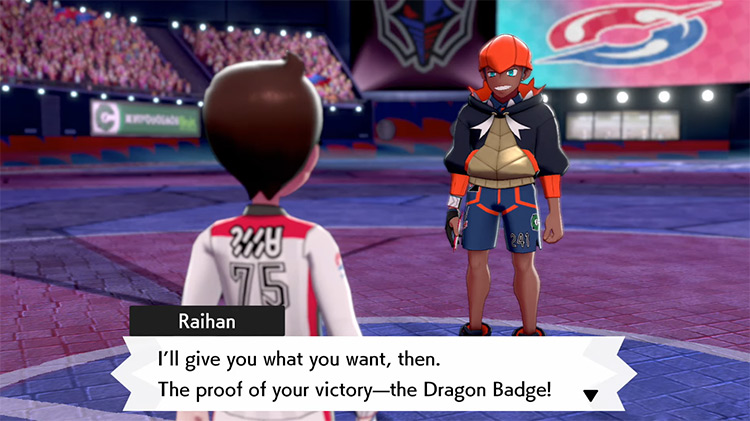
It’s a dragon head. That’s all. It’s just a very cool looking dragon head. Dragons in Pokémon are boss, so this spot is well earned.
7. Legend Badge
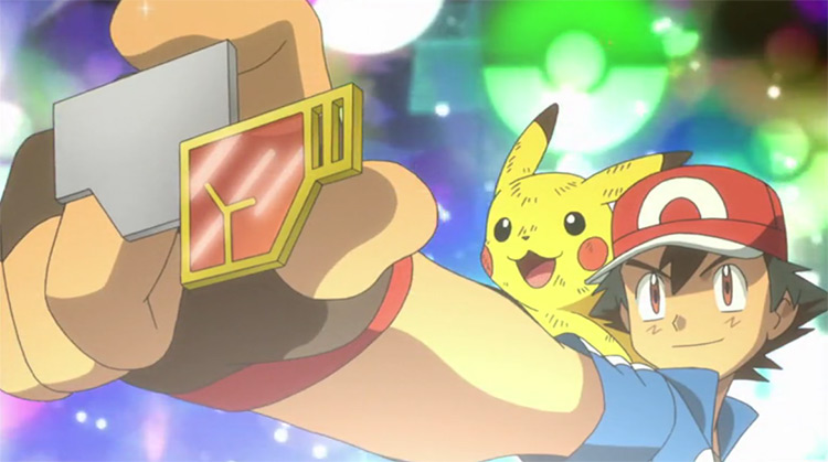
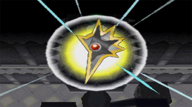
I have a full physical copy of all the Unova badges from back from when I played the TCG. That should make you really jealous, and if it doesn’t, there might be something wrong with you. The legend badge is the first one that I ever got. And it just so happens to be one of my favorite designs of all time. That being said, I have absolutely no idea what’s going on here. It comes from a dragon gym, but if it’s meant to resemble a dragon, then that aspect is lost on me. It’s really spikey, though. So that’s cool. I guess you could say that it makes me… edgy…
6. Trio Badge
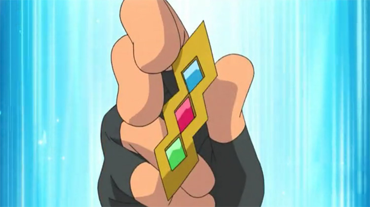
The first Unova gym is one of the more unique in the series. Rather than having one leader, you get one of three based on what starter you pick. This is a cool feature that I would like to see more of in the future. In case you couldn’t tell, the trio badge represents that brilliantly. It’s got three gems, one for each of the starting types. It ties into the overall theme of the gym perfectly. And is one of the best examples of how less can be more with these gym badges.
5. Basic Badge
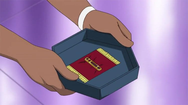
This might be the best example of less is more in a Pokémon gym badge. It comes from the normal type gym, which Cheren takes over in BW2. This is one of my favorite things to ever happen in a Pokémon game until Hop becomes a professor in a later game, so that does make me a bit biased. Given it comes from a normal type, this badge is absolutely perfect. It’s just a pretty looking line, sure. But it doesn’t need to be anything more for what it is.
4. Beacon Badge
Volkner is a point of contention for a lot of the Pokémon community, but there’s no denying that his badge looks great. He’s the leader of Sunnyshore’s gym, and his badge is a lighthouse. Lighthouses have always had a connection to electric types. Remember Ampharos? But it’s especially relevant here. One of Sunnyshore’s biggest attractions is the town’s lighthouse, so having a badge designed around that is a great example of the wider context of the gym being taken into consideration for the badge design. It’s not inherently electric based, though. Not sure why.
3. Hive Badge
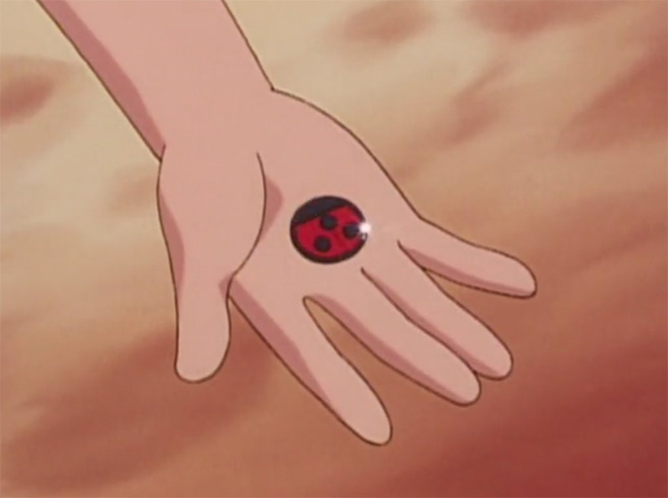
The hive badge is one of the most clever badges to ever come out of Game Freak, and I just know that the artist that designed it was chuffed with themselves when they came up with it. It’s a ladybug. And a really good looking ladybug. In case you missed that day in school, ladybugs are one of the coolest looking bugs in existence. I wouldn’t bat an eye if this badge was used as a logo for a small business, it’s that good. Whoever the genius is that came up with this design, they aren’t being paid enough.
2. Rising Badge
The rising badge has a pretty depressing name when you look at the wider context of Clair, the gym leader it comes from. She’s the underachieving cousin of the champion Lance. So the idea of her “rising up” must be a point of suffering when it comes to her self-image. It’s a great looking badge, though. So great that it gets damn close to the top spot. It’s basically the dragon badge taken up a notch. Instead of being minimalist, it’s an awesome looking mecha-dragon face. A perfect way to highlight how well Game Freak has done with the limited resources of the old games.
1. Cascade Badge
Misty keeps ending up on the top of my lists somehow. And no, it’s not for that reason. Her gym is simplicity personified, but simplicity done perfectly. Her Cascade badge is another example of this. What would you expect a water type gym to have as its badge? A wave? The sea? A bottle of water? No, the cascade badge is a water droplet. It also happens to have a few highlights that make the water droplet legitimately look like water, not just an artist’s rendition of it. I keep harkening on about how simple is better, and this is why. It relates to the gym, looks great, and doesn’t go overboard with some crazy-looking design. It’s my favorite looking gym badge of all time. Which is ironic given that it came from Gen I, and I’m a far cry away from a Gen I loyalist.



![]()
